How I Overworked a Flyer
I overworked myself. This time, it was in no part due to a bad client: Two Point Oh has been excellent with their new band lineup, and have taken me onboard for visuals. I'm very inspired by creative moshing and mixing. Too many times, the musicians go to their clique, and the designers theirs- and the two only ping each other and make an accord for joint ventures. We should be on each others' couches. Eric Timothy Carlson is integral to the music of Bon Iver precisely because he's in the room while it's getting made.
So, not to humblebrag, but aw shucks! I just cared too much again. This is a weekend tour partnering with the band Lovewell. A few locations out of their yearly lineup, that's all, and paste it on the Instagram grids. But I was transfixed. I set down the original type and information. I was given no rules, "get my freak on". It just developed from there. It was like the Elder Scroll. The Palantir. A good book you don't want to put down. Christina's World.
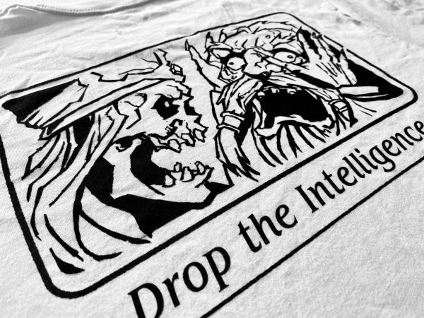
Band flyers are a wonderful expression of artistry. It invites experts and amateurs. Neither are the wrong choice. You'll see maximalists spitting inkwork and handlettering all over a page and, somehow, you can still read it. Minimalists who paste Helvetica delicately against blank negative space, somehow staying as engaging as an "everything everywhere" type flyer.
*Note: Helvetica and Grotesk type has a long history with underground/non-mainstream music promotion. Insert the Reagan for President image here.
You know this painting, Christina's World. It's by Andrew Wyeth, my greatest of all time painter. He spoke about the weeds and the grass that chunk up 90% of this painting, and how he spent months on the grass. Just.. getting it right. Masssaging the noise, we flyer-designers might say.
I wanted both worlds. I wanted maxi-minimalism.